The image
You have 25 seconds to prepare and 40 seconds to speak.
Sample answer (67 words, about 35 seconds)
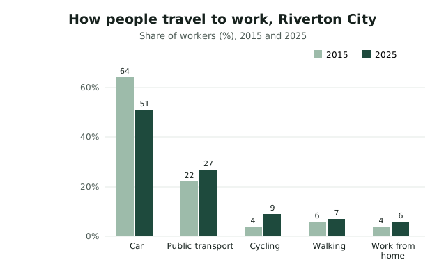
The bar chart compares how people in Riverton City travelled to work in 2015 and 2025. Driving remained the most common choice, but its share fell from 64 to 51 per cent. Public transport rose from 22 to 27 per cent, and cycling more than doubled from 4 to 9 per cent. Walking and working from home increased slightly. Overall, commuters are gradually moving away from cars.
The structure behind it
- Introduce: "The bar chart shows/compares…" (what, where, when)
- Main feature: the biggest, highest or most important thing
- Two details with numbers: one comparison, one change or contrast
- Conclusion: "Overall, …"
Keep a steady pace and don't stop for more than 3 seconds; a long pause can end your recording. Fluency and pronunciation count for more than describing every detail.
Practise it
Try this image yourself on the Describe Image practice page, which records your answer on your device and shows your start time and pauses. More: all Describe Image examples.