The image
You have 25 seconds to prepare and 40 seconds to speak.
Sample answer (63 words, about 35 seconds)
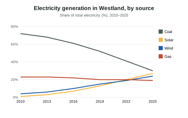
The line graph shows how Westland generated electricity between 2010 and 2025. Coal fell steadily from 72 per cent to just 30 per cent. In contrast, solar rose sharply from 1 to 27 per cent, and wind increased from 4 to 24 per cent. Gas remained fairly stable at around 20 per cent. Overall, renewable energy has grown rapidly while coal has declined.
The structure behind it
- Introduce: "The line graph shows/compares…" (what, where, when)
- Main feature: the biggest, highest or most important thing
- Two details with numbers: one comparison, one change or contrast
- Conclusion: "Overall, …"
Keep a steady pace and don't stop for more than 3 seconds; a long pause can end your recording. Fluency and pronunciation count for more than describing every detail.
Practise it
Try this image yourself on the Describe Image practice page, which records your answer on your device and shows your start time and pauses. More: all Describe Image examples.